POSTED 01.03.20 / BY C YATES
SIMPLE design
CATEGORIES
Design
Future
Connected
Methodology
Innovation
Technology
ABOUT ME
I am passionate about innovative design and creating user experiences at the intersection of art, science and technology.
RELATED POSTS
Design Methods
Cultivating Micro-Moments
Designers are often tasked with making things easier to use, reducing friction, or improving the experience - in essence make things simple. But what is simple? why does this matter? and how can we strive for simple design? I will try to answers theses questions by exploring why the most successful products often feel invisible and the lessons that philosophy, science, and nature can teach us as designers as we make sense of the complexity in an ever changing would of AI and exponential volumes of data;
"Truth is ever to be found in simplicity, and not in the multiplicity and confusion of things" Sir Issac Newton
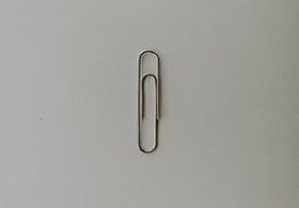
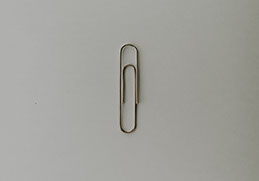
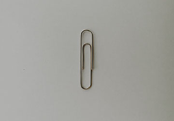
Historical references describe fastening papers together as early as the 13th century. During this time, people put ribbon through parallel incisions in the upper left-hand corner of pages. Later, people started to wax the ribbons to make them stronger and easier to undo and redo. This was the way people clipped papers together for the next six hundred years. In 1899, a patent was issued to William Middlebrook for the design, not of the clip, but of the machinery that made it. He sold the patent to the American office-supply manufacturer Cushman & Denison, who trademarked it as the Gem clip, in 1904 - this was the origin of the paper clip. A perfect example of simple design that has endured pretty much unchanged for over 100 years, used by millions of people. Other products for fastening paper have been developed, such as the stapler and bulldog clip, however the paper clip remains the most commonly used due to its simplicity; a single component that is cheap to manufacture, simple to use, and achieves the desired outcome of temporarily holding together loose sheets of paper.
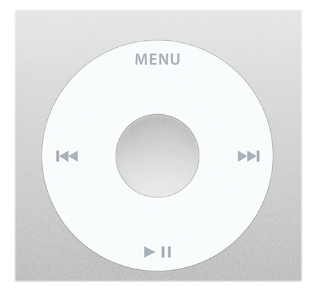
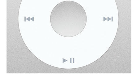
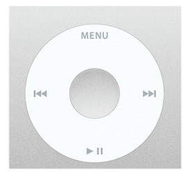
Another trait of simple design is that they are usually more adaptable - Indeed the paper clip has gone on to serve a wide array of uses, even being used to pick locks. There are many other examples throughout history of simple design; starting with the wheel, any other shape than a circle does not deliver the same level of outcome. With the invention of the steam engine the simple centrifugal governor provides a more effective way to run the engine. In the 20th century the transistor is a simple design that gave birth to the computing age, and more recently companies like Apple with the iPod click wheel have used simple design to create iconic products. This has paved the way for many more products adopting a more simple design approach.
I was recently looking for a more effective way to boil eggs, and purchased an egg steamer which uses a lot less water to cook the eggs. The product could have included a digital timer which would seemingly make it easier to use, however adding features can increase complexity, and a timer would require power, a display, buttons, setup. Simply using the laws of physics in that a certain volume of water creates the right amount of steam to cook the perfect eggs - just measuring the same volume of water each time (the device turns off when all the water has evaporated) means no timer is required.
"Everything should be made as simple as possible, but not simpler" Albert Einstein
Why is this important?
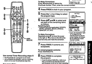
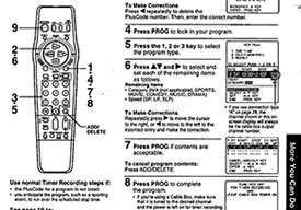
Sometimes as designers we can get distracted by all the new shiny tools, technologies, software, and materials available to us, and it can feel like you have to use all these tools, new ideas, technology, etc. to add more features to your product in order to differentiate or standout from the competition. This can create more complexity for the user and detract from the original purpose. Anyone who remembers the 80's may have struggled with the complexity of the video recorder or VCR remote and programming controls to perform one of its primary functions - record a TV program. This often involved many steps (which you could not go back to) and a combination of several buttons. Today recording a TV program is as simple as pressing one button. However to achieve this requires a vastly more complex array of systems (including WiFi, routers, Internet, servers, and software) then the IR controller and embedded software of the VCR. Which points to a key facet of simple design - it is often more complex to achieve. Today you can often experience a similar complexity in setting up home automation systems, browsing Netflix to find something to watch, or getting video conferencing to work
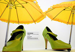
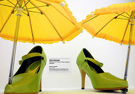
The challenge faced by designers is doing the hard work in understanding the problem and creating solutions that hide complexity rather than adding new features in a bid to help users deal with the complexity themselves. The danger in this approach is that it can mask the original purpose, and render the product useless. The Japanese have taken this approach to its extreme and invented a term for ideas that are ridiculous but at the same time seem useful; CHINDOGU
"Life is really simple, but we insist on making it complicated" Confucius
How do we define simple design?
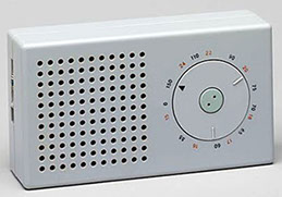
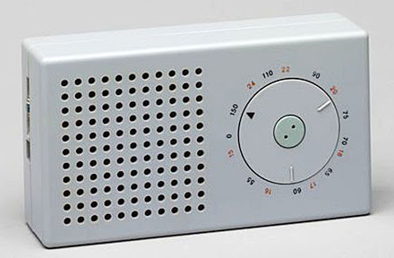
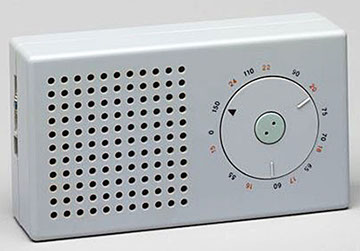
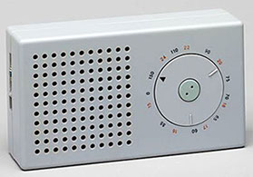
From an industrial design perspective it can be seen in the use of form and function; We can define simplicity of form as simple construction. For example, a table has simplicity of form, due to it only having two parts and a clear construction pattern that anyone can follow. This was evident in the Bauhaus movement; a German art school operational from 1919 to 1933 that combined crafts and the fine arts The school became famous for its approach to design, which strove to combine beauty with usefulness and attempted to unify the principles of mass production with individual artistic vision. Many items created in the Bauhaus workshops are characterized by clean lines, an innovative use of materials, and an affectionate embrace of technology befitting a modern lifestyle and with the mantra - Function serves purpose. A follower of the Bauhaus movement; Dieter Rams, best known for his iconic product designs with Braun, took an unobtrusive approach and belief in "less but better" - concentrating on the essential aspects, and not burdened the products with non-essentials - creating a timeless quality in his designs that have influenced many products.
"Simplicity is the key to excellence" Dieter Rams
GALLERY






The paper clip invented in 1904
The different uses for a paper clip
iPod scroll wheel
Egg steaming product
Chindogu umbrella shoes
VCR programming manual
Video conferencing
Bauhaus movement
Braun T3 pocket radio
KANO model
Gastalt principles
Golden Ratio
Challenges of AI
Duct tape saves the day on Mars
<
14 - 14
>
What can we learn from Philosophy?
A 13th century English Franciscan friar by the name of William of Ockham, who was a scholastic philosopher and theologian, used a preference for simplicity to defend the idea of divine miracles and came up with a theorem; Suppose there exist two explanations for an occurrence. In this case the one that requires the smallest number of assumptions is usually correct - Occam's razor - all things being equal the most simple is the right answer.
Vilfredo Pareto a 19th century Italian engineer, sociologist, economist, political scientist, and philosopher (and we thought having multiple careers was a 21st century invention) came up with the law of the vital few which states that, for many events, roughly 80% of the effects come from 20% of the causes - Pareto principle (also known as the 80/20 rule.
John Locke an 17th Century English philosopher and physician drew on the earlier Greek philosophers of Descartes; Simple Natures and the Concepts of Clarity and Distinctness to propose that simple ideas are the elements of thought we passively receive through sensation and reflection. According to Locke, simple Ideas mostly agree with things, since “the mind . . . can by no means make to itself any simple idea". Thus we can have ideas derived from one sense e.g., taste, smell, colour etc. or through more than one sense e.g., figure, motion, size etc.; or through reflection e.g., perception; or through sensation and reflection both e.g., pleasure and pain etc. He goes on to say that complex ideas are formed by the mind, by comparing, combining and abstracting from simple ideas.
This shows us that the ideas and thoughts surrounding simple design have roots stretching back into early philosophical theories.
Another area that has been influential in simple design is Japanese Zen Buddhism; which heavily emphasizes meditation and mindfulness. In fact, both “Zen” and “Chan” simply translate into 'meditation'. Steve Jobs’ love of simplicity in design was honed when he became a practitioner of Buddhism. After dropping out of college, he made a long pilgrimage through India seeking enlightenment, but it was mainly the Japanese path of Zen Buddhism that stirred his sensibilities. “Zen was a deep influence,” said Daniel Kottke, a college friend who accompanied Jobs on the trip. Jobs’ belief in the power of simplicity as a design precept reached its pinnacle with the three consumer device triumphs he produced beginning in 2001: the iPod, iPhone and iPad.
“Out of chaos, find simplicity. From discord, find harmony” Bruce Lee
What can we learn from Science?
In the world of physics and thermodynamics entropy is commonly associated with the amount of order, disorder, or chaos in a thermodynamic system. Put simply, entropy is a measure of disorder, and the Second Law of Thermodynamics states that all closed systems tend to maximize entropy. Reversing this ever increasing tendency toward disorder requires the input of energy. That's why housekeeping requires effort. Left on its own, your house would get dusty, spiders would move in, and eventually, it would fall apart. However, the energy put into preventing disorder in one place simultaneously increases it somewhere else. Overall, the entropy of the universe always increases. This means that according to the Second law overall the world is falling apart in disorder - however this is happening at a very slow rate and it is doing it in a seriously interesting way. It can be likened to a waterfall that is rushing down, but the waterfall throws up a spray of structure, and that spray of structure might be you or me or a daffodil or whatever. So you can see that in the unwinding of the universe and collapse into disorder, it is still possible to create order, but this requires effort or energy.
So how does this relate to simple design? Ordered systems tend to be simpler to use, however even the laws of physics tell us that to achieve order requires energy or effort. If we use the example of exercise; it may seem simpler not to exercise as doing exercise is complicated; requires planning, equipment, mental and physical effort over just doing nothing, but doing nothing leads to more disorder as the body stores fat, muscles become weaker, arteries get clogged, and organs become less efficient. Exercise is the effort that is restoring order which leads to a better outcome; with exercise performing tasks is easier sand simpler things like walking are easier, ascending stairs is simpler, greater mental alertness leading to easier decision making, and overall body efficiency is improved resulting in less injury, fatigue, or disease. So if you are not convinced exercise is good for you, think of it as extending the life of the universe!
Principles of simple design?
Don Norman is often referred to as the godfather of simplicity in industrial design. He has championed the intuitive design of products ranging from door knobs and water faucets to the control panels of nuclear power plants. Design excellence, he wrote, is the most important key to winning over consumers. From his work he crafted six principles of design - a number of these have particular relevance to simple design:
Visibility: can I see it? This is the most basic principle. The more clear and visible functions are, the more likely users will be able to know what to do next. In simple design only most needed functions should be visible.
Mapping: where am I and where can I go? This refers to the relationship between controls and their effects in the world. In simple design the mapping should be as direct and straightforward as possible.
Affordance: how do I use it? Is an attribute of an object that allows people to know how to use it. In simple design use affordances which are clear and obvious.
If Don Norman is the Godfather then Steve Jobs is perhaps the golden child. He is often quoted as saying "Simple can be harder than complex: You have to work hard to get your thinking clean to make it simple. But it's worth it in the end because once you get there, you can move mountains". In order to do this you really need to understand the problem. This requires extensive research and getting out of the building. This was unthinkable to those in the Bauhaus. As we put the person into the design, especially as we are concerned about people’s abilities to understand and make use of our evermore complex, electronically mediated objects, we need very different design principles. Form alone will no longer suffice. We must understand people, how they work and behave and, especially, how they can come to understand complex technology. It is the role of the designer to make the complex appear to be simple.
Another principle often associated with simple design is minimalism. At its core, being a minimalist means intentionally promoting the things we most value and removing everything that distracts us from it. It is a life that forces intentionality upon us. As a result, it forces improvements in almost all aspects of your life. Whilst mainly regarded as an art movement that began in post–World War II Western art, most strongly with American visual arts in the 1960s and early 1970s, the essence that drives artists to consider minimalism can also be applied to product design - in the power of minds and mental states to be about, to represent, or to stand for, things, properties and states of affairs being directed towards the design to remove distractions and focus on the value. A similar idea is the YAGNI Principle {You Aren't Gonna Need It) which is a used in extreme programming (XP) that states a programmer should not add functionality until deemed necessary. XP co-founder Ron Jeffries has written: "Always implement things when you actually need them, never when you just foresee that you need them". Both minimalism and YAGNI are processes and principles of design with the primary objective and/or value to not add functionality that is not of immediate use.
In product design recent focus has been on adopting a lean methodology and creating an MVP (Minimum Viable Product or Proposition) which is a version of a product with just enough features to satisfy early customers and provide feedback for future product development and was popularized by Steve Blank and Eric Ries in the book Lean Startup. Whilst minimalism can help with removal of features they still need to have value, otherwise customers with not be satisfied or consider the product useful, this is where viable steps in. In order for something to be considered Viable (aligns with business goals and has a sustainable business model) you also need to consider Desirability and Feasibility.
Desirability; Does the product address a problem or meet a need? Do you understand the people who are going to use the product and will it appeal to them?
Feasibility; Is the technology needed to make the product available or within reach? How long will this take? Can the organization actually make it happen.
The MoSCoW method (Must have, Should have, Could have, and Won't have) is a technique used in management, business analysis, project management, and software development to reach a common understanding with stakeholders on the importance they place on the delivery of each requirement:
M - Must have this requirement to meet the business needs
S - Should have this requirement if possible, but project success does not rely on it
C - Could have this requirement if it does not affect anything else on the project
W - Would like to have this requirement later, but delivery won't be this time
Used in conjunction with MVP can help to focus the design to achieve higher level of desirability for those features that are must have, rather than spreading the design effort over range of features that are not needed.
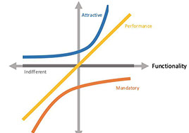
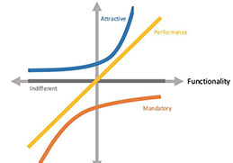
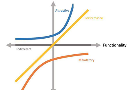
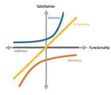
Noriaki Kano, a Japanese researcher and consultant, published a paper in 1984 with a set of ideas and techniques that help us determine customers satisfaction with product features. These ideas are commonly called the Kano Model and are based upon the premise that customer satisfaction with product features depends on the level of functionality that is provided and how much or how well they’re implemented. Features are classified into four categories:
Performance; Some product features behave as how we might intuitively think Satisfaction works: the more we provide, the more satisfied our customers become. Because of this proportional relation between Functionality and Satisfaction, these features are usually called Performance features.
Must-be; Other product features are simply expected by customers. If the product doesn’t have them, it will be considered to be incomplete or just plain bad. This type of features is usually called Must-be or Basic Expectations.
Attractive; There are unexpected features which, when presented, cause a positive reaction. These are usually called Attractive, Exciters or Delighters.
Indifferent; Naturally, there are also features towards which we feel indifferent. Those which their presence (or absence) doesn’t make a real difference in our reaction to the product.
An important fact to note is they are not static — they change over time. What customers feel about some product attributes now is not what they’ll feel in the future. Attractive features turn into Performance and Must-be features as time goes by.
Visual-design principles inform us how design elements such as line, shape, color, grid, or space go together to create well-rounded and thoughtful visuals. There are many principles in this area but the following have particular relevance to simple design:
Scale: The principle of scale refers to using relative size to signal importance and rank in a composition. The most important elements in a design are bigger than the ones that are less important. The reason behind this principle is simple: when something is big, it’s more likely to be noticed.
Balance: The principle of balance refers to a satisfying arrangement or proportion of design elements. Balance occurs when there is an equally distributed (but not necessarily symmetrical) amount of visual signal on both sides of an imaginary axis going through the middle of the screen.
Contrast: The principle of contrast refers to the juxtaposition of visually dissimilar elements in order to convey the fact that these elements are different (e.g., belong in different categories, have different functions, behave differently).
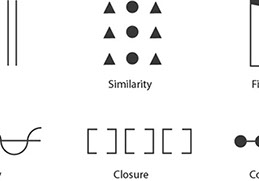
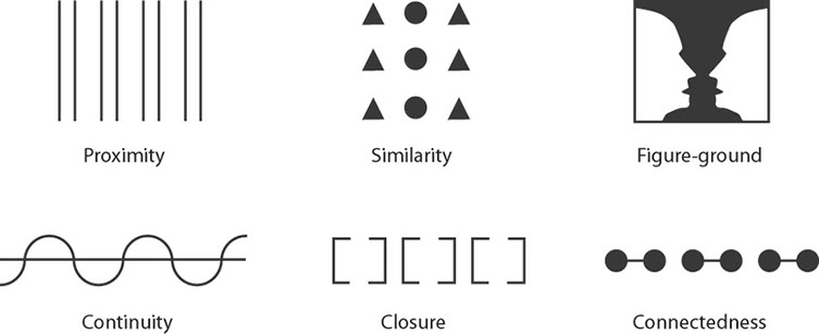
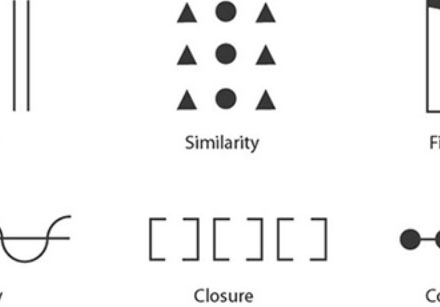
Gestalt Principles: These explain how humans simplify and organize complex images that consist of many elements, by subconsciously arranging the parts into an organized system that creates a whole, rather than interpreting them as a series of disparate elements. In other words, Gestalt principles capture our tendency to perceive the whole as opposed to the individual elements.
Colour: Are largely responsible for dictating the mood of a design — each color has something a little different to say. Green tends to make people think of non-profits or the environment, while red causes stormy emotions like anger, blue is more calming and passive, and yellow creates a sensation of happiness.
Space: The parts of your design you choose to leave blank are just as important as the ones you’re filling with colors, text and images. Negative space creates shape and can help highlight the most important pieces of information in your design. Never underestimate the power of simplicity.
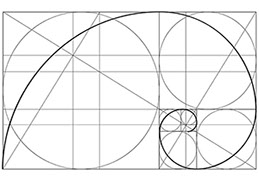
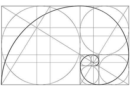
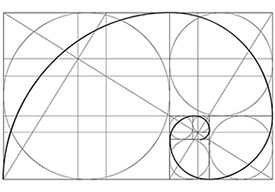
The Golden ratio has been used throughout history (it is believed the Golden Ratio has been in use for at least 4,000 years in human art and design) to create design elements that have an ideal visual appeal because the shape is rooted in nature and mathematics, it’s the perfect combination of balance and harmony. Simply, the golden ratio (also called the golden rectangle and golden mean) is a shape with a proportion of 1 to 1.618. It helps to establish the right emotional and visual tone with users. What the golden ratio does is cue you into to focal areas where the user is likely to focus and look based on nature. It helps create balance and scale, even when not wholly intentional.
In Conclusion
In the rapidly evolving world there is a propensity for things to become more complex; the accumulation of technology and innovation is more often adding to the complexity rather than taking away. Today on average we check our smartphone 150 times a day and are bombarded with communications and notifications from an increasing number of connected devices. According to Cisco, 500 billion devices are expected to be connected to the Internet by 2030. Each device includes sensors that collect data, interact with the environment, and communicate over a network, by which time the average person is likely to own around 15 connected devices all vying for our attention. The impact is a world with vast oceans of data and armadas of AI solutions to help us navigate to islands of enlightenment. In all of this growth and progress it is easy to loose sight of the outcome and the purpose or need driving the design and get lost in the technology or the novelty. In an increasingly complex society it is important not to add to the cognitive load but take away from it. This is why simple design is vital especially when considering the big issues facing humanity; climate change, social impact, health, food, and energy production.
As designers we aspire to make products and services that are simple, effortless, stress free and a joy to use. Do the hard work to make it simple. Making something easy to use is hard especially when the underlying systems are complex. Don’t settle for “well it’s always been that way” as an answer. It’s usually more and harder work to make things simple, but it’s the right thing to do. ‘Keep it simple’ should be a guiding principle for everything we do.
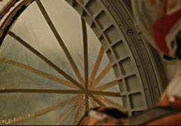
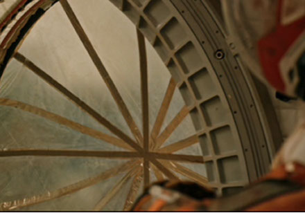
If science fiction has taught us anything, in space the thing that is going to save your life what things turn bad, is not the multi-million dollar space suit or the high-tech carbon nano-tube fabric, but the simple duct tape!
LEAVE A COMMENT

